
15 Most Recent [RSS]
More...
|
I want my creative whitespace ... sometimes.
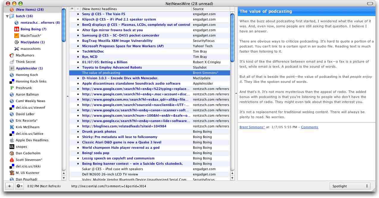
If you've been a nice little blog reader, you've probably read Wolf's article on borders in OS X windows and how they shouldn't be always used. Basically, Wolf is happy about NetNewsWire, where Brent moved the lists closer to the border, instead of having empty space on all four sides around the three lists of the RSS reader.
Wolf showed the extraordinary common sense he has ( ;-) ) by quoting one of my comments to him, and agreeing with it. The central part of what I said was basically: I think the only place where margins are compulsory are the 12 and 6 pixel-spaces between individual items, so stuff doesn't look too crammed.
Anyway, I usually go by the following guideline: If I have buttons in a window, they get a margin. If I only have one big scroller, list or text field, or a couple of them with splits between them, I let them go flush to the edge. about which Wolf notes:That heuristic sounds about right. Still Brent has buttons in his main window, and they still look great -- not at all crammed. Here's where I disagree. I actually think the new NNW design does look a little more crammed. I personally would have moved the lists up to the edge at the top, left and right borders, and left a little more room (and pinstripes) at the bottom. That would also put more distance between the status line and the list items, which I think collide a little at the bottom. It's like in print design: Things that don't belong together should be separated by space. Separator lines are a nice addition or enforcement, but don't suffice.
Look at the right side (the content pane) in Wolf's screen shot: The text doesn't go to the bottom, so there's enough room and it looks pretty. But for the full middle pane, it doesn't quite work. By spacing the buttons at the bottom with the recommended 6-pixel margins, you'd enforce the needed breathing room (don't believe me? look at my mockup). Incidentally, that's also what Apple do e.g. in Address book. And to prevent it from looking as crappy as Eudora's button bar in compose windows, make sure the border at the top and bottom is the same.
Anyway, that's how I feel about it. What do you say? | |
![[ Zathras.de - Uli's Web Site ]](http://www.zathras.de/angelweb/themes/barsnstripes/img/masthead_blog.jpg)