
15 Most Recent [RSS]
More...
|
How not to do the multi-row tab control
By now everyone knows that multi-row tab controls are a usability nightmare waiting to happen. Either they shift around tabs or whole rows to keep the physicality of a filing card with a tab at the top intact, destroying muscle memory in the process, or they don't move tabs and destroy the physicality of the metaphor because the tab seems to be "torn off" from its filing card. Both approaches aren't very desirable. But while I'm at it, Apple's MacOS X-approach to the tab control has been traditionally bad, so let's not smirk yet. I'll take Windows' single-row tab controls over the OS X ones any day.
But since it's so much fun to hit an application while it's down, and since this is a new confusing concept introduced, I thought I'd pick up this old topic once more. I'm talking about the single-tab row:
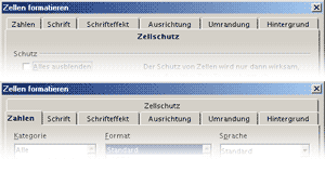
I've accompanied the first tab by a picture of how it looks when another tab is selected, so those of you not fluent in German can make out that this really is a tab control. The problem is just that there is one tab that stretches an entire row, and when it is selected, it looks as if the tab title was just some text on the tab body, while none of the tabs looks selected. An easy way to solve this would be to just calculate the width of the tabs beforehand, and if you realize there are more than would fit in one row, to evenly distribute them across the rows.
Yes, I'm aware that this involves some fiddling with maths and means you need one loop for the layout and a second one for the display, but hey, good UI is work. I'm not naming the app here. It's an open-source app that is otherwise fairly handy, and I don't expect a volunteer project to have perfect UI. OTOH I assume that this is a standard Windows system control, and thus Microsoft should have taken the time to fix this.
But wait, they're working on transparent title bars these days and don't have time ... | |
![[ Zathras.de - Uli's Web Site ]](http://www.zathras.de/angelweb/themes/barsnstripes/img/masthead_blog.jpg)